Responsive website re-design for Non-Profit
Got DME?
Problem
Wheel It Forward is a Non-Profit organization located in Fairfield County, dedicated to lending out and accepting donated Durable Medical Equipment (DME). Their mission is to offer DME to individuals who cannot afford it while simultaneously preventing the disposal of billions of pounds of DME into landfills. Currently, Wheel It Forward is working on establishing a National Directory, enabling people to easily locate places to borrow or donate medical equipment.
The current user interface lacks clarity and consistency in presenting information about locations for borrowing or donating durable medical equipment (DME). Users struggle to find the relevant details they need, resulting in confusion and frustration. The design fails to provide a seamless and intuitive experience when exploring options to acquire or contribute DME within their local area.
Solution
Redesign their website so users can directly connect to locations that lend out or take donated DME easily and quickly.
Landing page that explains what Got DME is and what they do
Resource Page that provide links and instructional videos on how to use medical equipment
Search feature to find locations to borrow or donate equipment
Detail Page that shows more information about location
Project Scope
Responsive Website Re-Design
Role
UX Designer (Research, Visual Design, Interaction Design, Usability Testing)
Toolkit
Figma, Figjam, Zoom, Maze
Discover
My main goal was to understand the client’s need. I had discussions with them to explore potential user challenges, understand their vision and goals for the website, and align with their overall business objectives.
I also conducted a competitive analysis chart to assess what other lending services were out there. This allowed me to understand their approaches in reaching users and their website setups in greater detail.
Market Research
The Challenge of Finding Interviewees
Finding individuals to interview about their experiences with borrowing or donating medical equipment proved to be a significant challenge. At this stage of the research process, my main focus was on attaining a diverse group of potential users rather than merely aiming for a large number of interviews.
During the interview process, I had the opportunity to speak with three individuals: one who required medical equipment for an extended period and was funding it out of pocket, another who had utilized Wheel It Forward for DME, and an Occupational Therapist whose patients were in constant need of DME.
100%
of users emphasized the importance of having the process details when donating or borrowing DME
66%
of users conveyed they often struggle with using equipment due to a lack of instructions
66%
of users mentioned they had never known it was possible to borrow Durable Medical Equipment
Define
Having collected valuable insights from user interviews, I organized the information into an Affinity Map, categorizing notes into pain points, essential information, and acquiring equipment.
Organizing Data and Insights
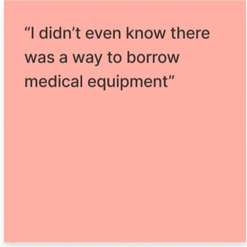
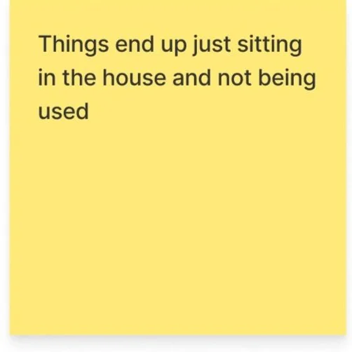
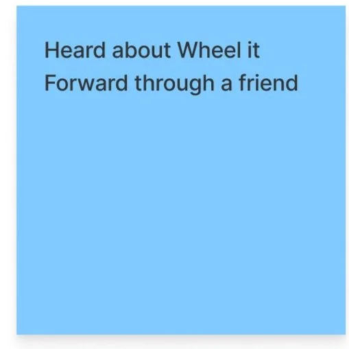
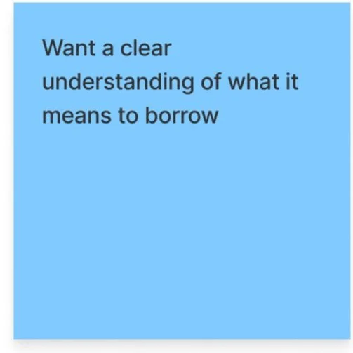
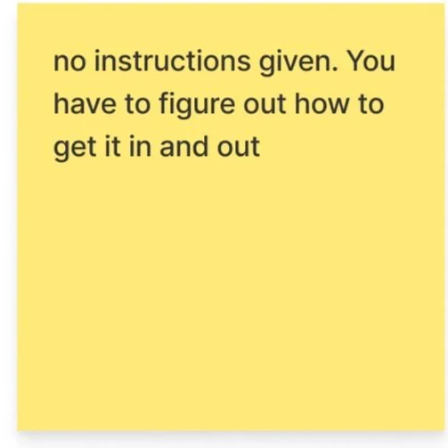
“I didn’t even know there was a way to borrow DME” - A
When creating the customer journey map, I traced the steps of a caretaker seeking to borrow medical equipment in Arizona after her mother’s stroke. This exercise provided valuable insights into the various stages and steps involved in completing this task. It also allowed me to better gain a better and deeper understanding of emotions of the user at each stage.
Diving Deeper into the User
I created two user personas to gain deeper insights into potential users for a product like this. Having these personas readily available throughout the design process has proven to be extremely beneficial. They serve as a constant reminder of the target audience and the diversity of individuals who will utilize the product.
User Personas
Jason, a college student, broke his leg playing football and is now in need of crutches which he prefers not to buy totally new.
Maria, the primary caregiver for her mother, needs a lot of medical equipment after her mother had a stroke but can’t afford everything they need.
Develop
With the pre-existing website in mind, I aimed to streamline its structure and navigation. To accomplish this, I developed a sitemap that served as the blueprint for a seamless and simplified user experience.
Information Architecture
Following the customer journey map, I created a user flow showing the route in which the user would find DME lenders in Arizona.
User Flows
As a user, I want to check if there are DME lenders near me in Arizona, so that I can avoid paying for equipment.
Deliver
I began creating lo-fi wireframes with pen and paper to rapidly come up with solutions to better streamline the process of finding locations to borrow or donate DME.
The most important aspect of this website is searching for a lending location, so it was crucial to make the search feature front and center on the home page. I wanted the users to be able to search by state or zip code without feeling like there were too many options and buttons to go back and forth.
Concept Sketches
I then moved on to create mid-fi wireframes that showed a more detailed structure of the site. My primary objective centered around refining and enhancing the informational architecture of the existing website and the main search feature, which felt congested and was causing confusion among users. To ensure alignment with the client's vision, I scheduled a meeting to discuss the designs before advancing to the hi-fi prototype stage.
Mid Fidelity Wireframes
Since Got DME was already associate with the brand Wheel it Forward, I decided to keep the already existing blue color palette. The client requested having the color green added to the color scheme to represent the idea of recycling that is so engrained in the organization. Additionally, the client wanted to keep the original logo.
UI Kit
Following a productive meeting with the client and addressing any initial design concerns, I proceeded to develop hi-fi wireframes. The client gave me a lot of design freedom and only requested the addition of the color green, to represent the recycling aspect of the product.
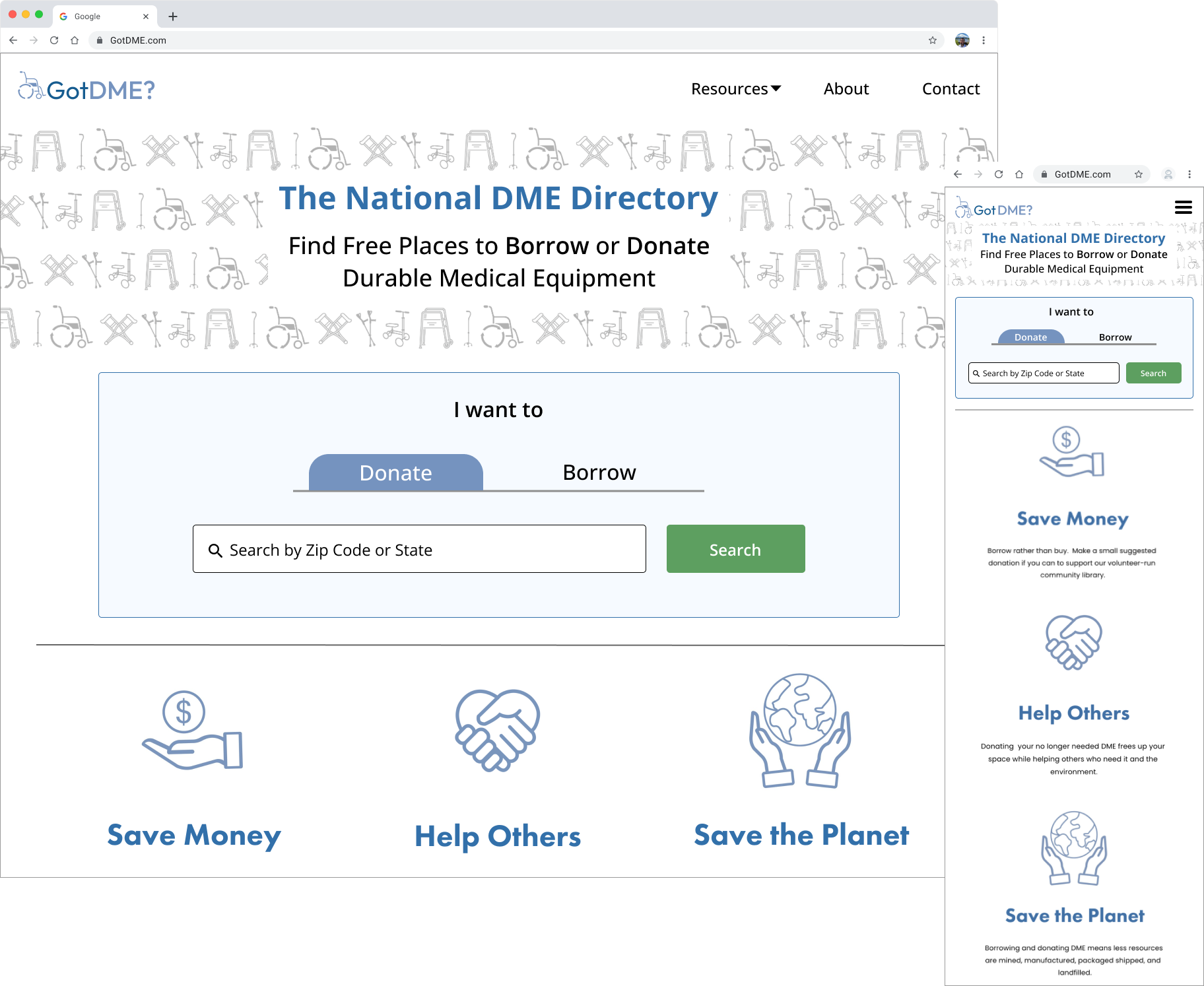
To provide a clear visual comparison, I will show the design through before-and-after pictures, illustrating both the original website and my re-design.
Mockups and Prototyping
Before
Home page felt cluttered and crowded. Search feature was messy and not intuitive.
Home page has good flow and hierarchy. Immediately tells the user what they do and simple search feature.
After
Results page needed cleaning up and work on informational architecture. Borrow and Donate tags were confusing and very wordy.
Before
After
Results page is much cleaner with simple lines separating listings. Borrow and Donate tags are clear and straightforward.
Detail page text was very small and needed more space between information. Borrow and donate boxes are too dark and need better spacing.
Before
Detail page text is much larger and easier to read for all people. Borrow and donate boxes are now centered and more readable.
After
Mobile Screens
Since I was designing for a responsive website, it was very important to also design mobile screens showing how it would carry over to different devices.
Home Page
Results Page
Details Page
I conducted both unmoderated and moderated user testing through Maze. The feedback from the 11 participants was overwhelmingly positive, with a 100% success rate in completing tasks. Users found the tasks to be intuitive, clear, and straightforward.
Several improvements were made to the final prototype based on feedback. The navigation label for videos was changed to 'instructional videos' to ensure greater clarity for users. Additionally, the filter dropdown for equipment was modified to be opened when landing on the page, streamlining the process with fewer clicks and increased efficiency.
Usability Testing and Iterations
2 out 3
100%
tasks that user completed had a 100% direct success rate
of tasks were completed under the average duration of 60 seconds
Learnings
This project was a valuable learning experience for me as it taught me how to effectively work within an existing business model and cater to client needs. My primary focus was on UI enhancements and streamlining the user experience throughout the project. I also learned how to effectively articulate my design decisions while speaking to the CEO of the company.
The client intends to implement my designs on their beta website in January 2024. Additionally, I have plans to re-design their contact page and about page in the near future.
