
TripPlanner
Customized trip planner and itinerary creator
Project Scope:
Trip planning website
Team:
Product Designer, Product Manager, Two Developers
Role:
Product Designer (Research, Visual Design, Interaction Design, Usability Testing)
Toolkit:
Figma/Figjam, Notion, Trello, Miro
The lack of personalized experience coupled with the time it takes to navigate travel content online makes it challenging for a lot of travelers when deciding on where and where to travel.
For groups of two or more travelers, varied interests and differences in lifestyle makes it extremely difficult to plan travel. To alleviate this problem most group travelers often turn to companies curating travel to specific destinations which are very expensive, offer little to no flexibility and uncertain group dynamics during their travels.
Lack of personalized trip planner tools
The Problem
The Solution
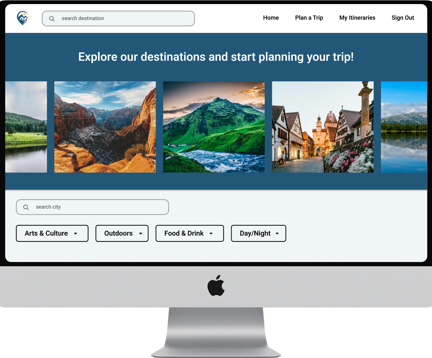
Create a trip planer tool that sets us apart from competitor
We aimed to create a trip planning tool that offers more customization and serves as a one-stop shop, surpassing competitors. To achieve this, we needed to deeply understand our users' needs to accurately identify the problem we were solving.
Research
Trip planning apps and websites lack opportunities for personalized trips and collaboration
Competitive Analysis
After thoroughly analyzing the top six travel planning apps and websites, we identified their key strengths and weaknesses. This analysis enabled us to pinpoint opportunities and gaps in the market, guiding us towards innovative solutions to address existing problems.
People spend over 5hrs consuming online travel content to seek inspiration and plan their trip.
Most people plan their trips and find things to do via internet research
Most people like to have a balance of set itinerary and flexible schedule
People prefer to travel with their friends/significant other/family
It is very challenging to create a travel plan that accommodates every people in the group
Along with the product manager, we conducted a survey to better understand the pain points and needs of people when planning trips and making itineraries. This would help us narrow down our focus of the MVP and get more insights into how we can help people plan trips easier.
People are overwhelmed by the amount of information there is when planning a trip
User Surveys
Ideation
Minimize the steps for a user to find activities and plan a trip
Task Flows
Stem Kitchen was using a typeform as their order system since they needed to gather a lot of information from the client including cadence, preferences, dietary restrictions, etc. After reviewing the typeform it was obvious that their order system needed to be simplified with fewer steps for the user.
Design
Mid Fidelity Wireframes
Focusing on the structure and content of the website
Given the numerous important elements and essential information that needed to be easily accessible to users, I prioritized the website's structure and content before incorporating UI inspiration.
The client and I collaborated closely to ensure that the language was clear, easy to follow, and authentically represented Stem Kitchen
Primary Colors
Secondary Color


CTA Color


Neutrals

Figma file with comments from stakeholder meetings
Hi Fidelity Wireframes
Sharpening the design and incorporating UI elements
Incorporating the color green was essential, as Stem Kitchen is a plant-based meal service, and environmental consciousness is a core aspect of its origin.
Adding purple as a secondary color conveyed femininity, highlighting the fact that this is a woman-owned business, and also brought a sense of creativity, reflecting the care put into each dish.
For the CTA elements, we wanted a color that was bright, loud, and fun. Inspired by one of the client’s favorite brands, Graza, we chose a vibrant lime green.
Gallery to get user excited by the food and options Stem Kitchen offers
Explanation on how the service works as the first text section user sees
Easy and visual way to see the different plan options they offer
Section to explain the benefits of a plant based meal plan
Signature plans with short explanations and a CTA button to learn more
Section providing user with some background into the founder and chef of Stem Kitchen
Services, including signature programs, custom plan, and catering
Testimonial section
FAQ section
Home Page
Key Focus: Crafting an Effective Home Page
The home page was the most crucial part of the website, designed to clearly articulate the service's purpose and functionality. It provided essential information, enabling users to understand the value proposition and easily navigate to the ordering process, driving engagement and conversions.
Ordering system condensed and clear
I developed an ordering system with three main sections: basic contact information, meal selection, and payment details.
By streamlining the process and creating a clear, user-friendly path, we ensured that users could easily complete their purchases.
Section explaining the custom and catering plans which don’t fall under signature offerings