Conceptual Project
Workspot
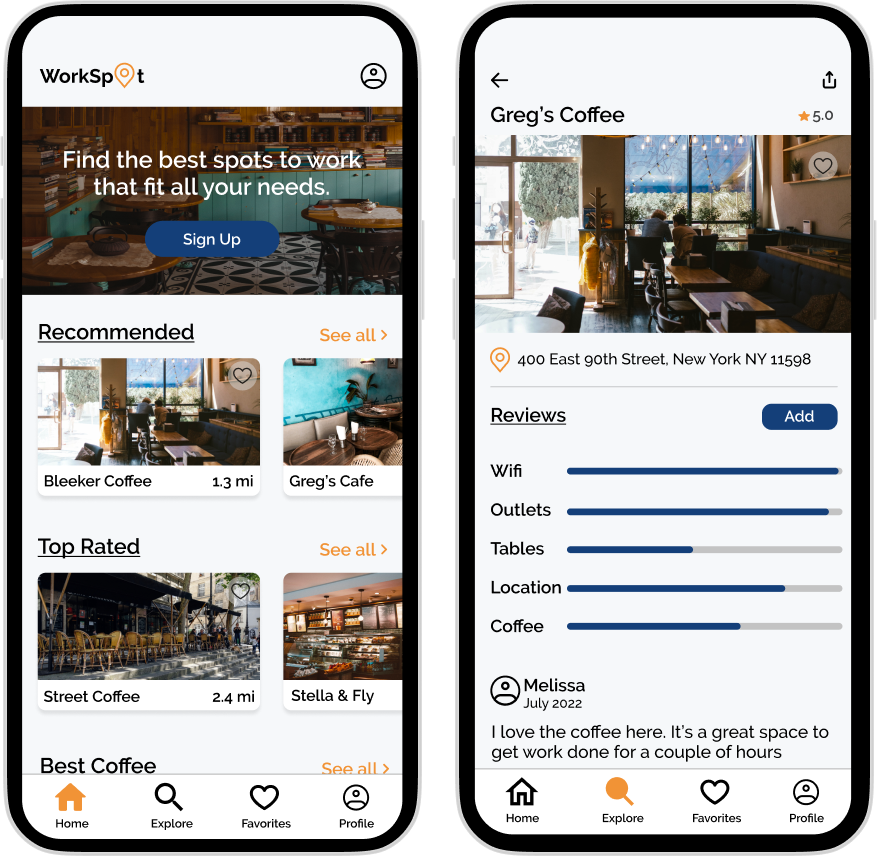
App to help people find cafe’s, restaurants, and libraries to work from.
Project Scope:
End to end app
To combat this, people seek shared workspaces or outside locations to get work done during their day. It is very hard to find spots that meet all of one’s needs and preferences for you to have a successful and productive day.
Since COVID-19 hit the world, many offices and schools have gone fully remote or hybrid. As a result, many people are now in their homes with lots of distractions.
Problem
Solution
Create a platform to connect people looking for places to work to locations in their area and allow users to narrow down their search by very specific needs and preferences.
Role:
UX Designer (Research, Visual Design, Interaction Design, Usability Testing)
Toolkit:
Figma/Figjam, Calendly, Zoom
Discover
The primary objective for looking at similar products was to gain insights into how they were tackling similar problems. Additionally, I wanted to familiarize myself with potential users and recognize their pain points and challenges.
Competitive Analysis
Understanding the Needs of Remote Students and Workers
I conducted interviews with 4 individuals who are remote/hybrid workers and students to gain valuable insights into their preferences, needs, and motivations when selecting a workspace away from home. My goal was to understand the factors influencing their choices and discover how they typically find and choose cafes and other work-friendly locations.
100%
of users said they prioritize good WiFi, coffee, and spacious tables when selecting a work cafe
of users mentioned the social aspect of meeting friends to study or work together
75%
of users emphasized the importance of leaving home during the workday for the sake of their mental health
60%
100%
of users expressed the importance of a good ambiance and lighting in their choice of a workspace
100%
of users rely on google as their primary place to find workspaces
Define
Prioritizing User Problems and Challenges
Having gathered valuable insights and data from interviews and market research, I wanted to organize and make sense of all the information. Prioritizing problems or opportunities based on the frequency and severity of user issues helped me focus design efforts on addressing the most critical user needs and challenges, leading to more impactful solutions.
The main themes gathered from my data were preferences when finding a workspace, motivations for working in a cafe, motivations for working at home, how they find a place to work, and general work/study schedules.
“I want to be excited to find remote spaces to work” - L
I crafted two user personas, one for a hybrid worker and the other for a remote student, each with distinct motivations and objectives for seeking a workspace beyond their homes. Keeping these personas in mind consistently realigned me with the core problem I was trying to solve.
User Personas
David, a remote student, wants to find a place to work with good wifi, coffee, and tables since he knows it is good for his mental health and will keep him motivated.
Samantha, a hybrid worker, loves working from home since she can get a lot of house things done but would love to find new places to work where she can take calls and meetings and be outside.
Develop
Developing the app required envisioning the core functions and pages. The most important part of the app would be its browsing function so it was integral for it to be easily navigable and would bring results with minimal clicks. The sitemap was instrumental in mapping out the structure and organization of the product.
Informational Architecture
I created two distinct user flows that illustrate the paths users would follow to find a location based on their specific preferences. The first flow demonstrates a user signing up and exploring locations through a list view, while the second flow portrays a logged-in user browsing through a map view.
User Flows
Creating Minimum Viable Product (MVP)
Having carefully reviewed all the gathered insights, the MVP would be a mobile app with a primary focus on helping users in locating suitable cafes, restaurants, and libraries to work from. The app would also offer filtering options to align with their specific preferences and needs, since this was really important to the users.
Deliver
Sketches
By utilizing pen and paper for my lo-fi wireframes, it enabled me to swiftly and flexibly sketch out ideas without constraints.
Transitioning to mid-fi wireframes, my primary emphasis was on the app's core functionality. I aimed to create an intuitive and familiar user experience, keeping the main goal in mind, enabling users to easily and quickly locate a suitable spot to work.
Mid Fidelity Wireframes
With the primary objective being the creation of a dependable, trustworthy, and user-friendly brand, I decided on a simple name "workspot." The brand's main colors, orange and blue, were chosen to symbolize reliability and trust, fostering a strong connection with the users.
The Brand
UI Kit
I created a UI kit to facilitate consistency throughout my design and have a guidebook to go back to.
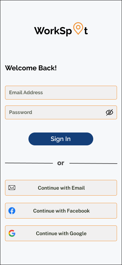
In the final step, I completed the mockups with all the branding elements integrated. My attention remained centered on the main screens and core function, ensuring users could easily and swiftly find a suitable workspace. In addition, I created 3 interactive prototype flows for usability testing, which would help me better understand what was working well and what was unclear or causing confusion.
Mockups and Prototyping
Flow 1 - starting at the log in page, users will browse locations using the list view and then add a review to Greg’s cafe
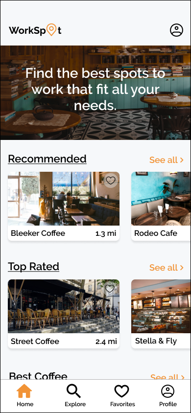
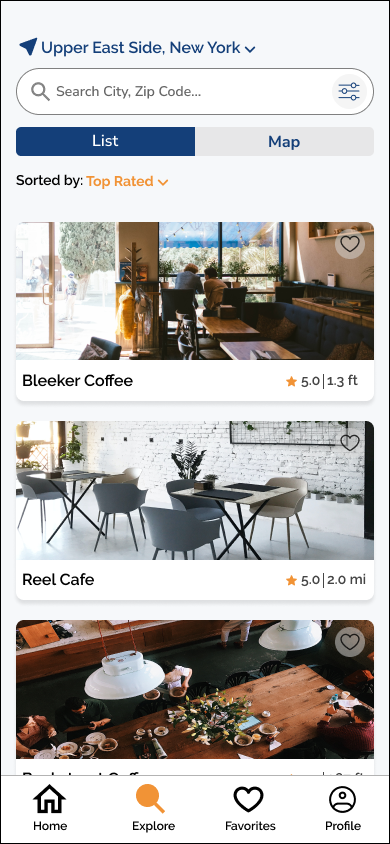


Flow 2 - starting at the home page, users will browse locations using the map view and add Greg’s cafe to their favorite

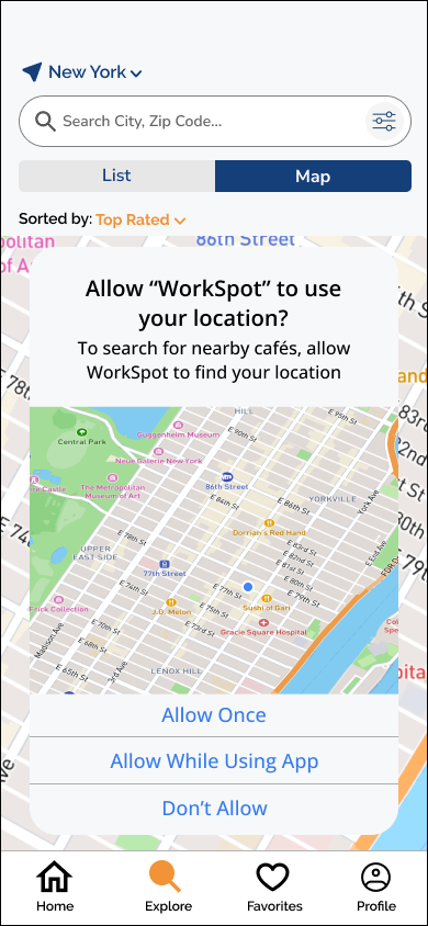

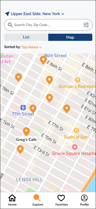
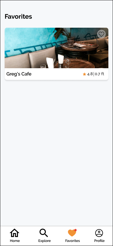

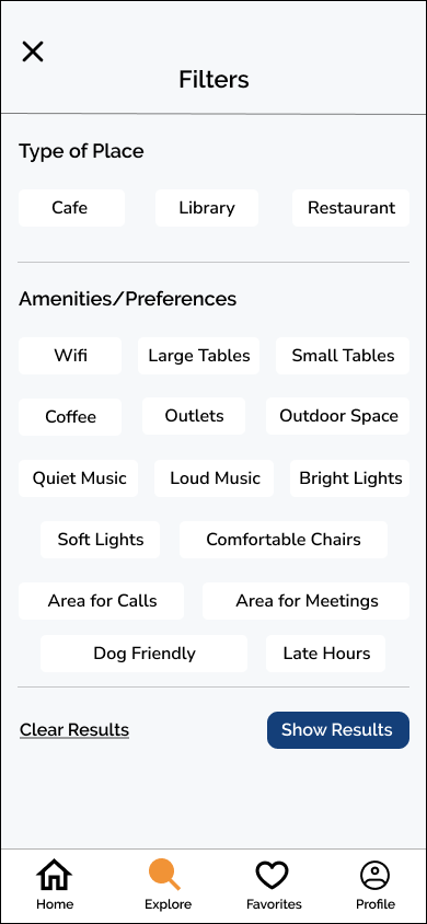
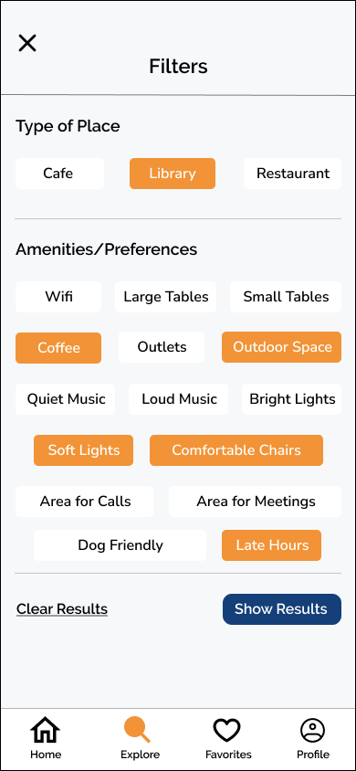
Flow 3 - starting at the home page, user will browse locations using the filter options

Problem: Users found that the original placement of reviews, which were on its own page, challenging to locate and not where users typically expected them to be. Furthermore, users expressed the desire to see the number of reviews alongside the star ratings for each location. Additionally, users found the combination of distance and review rating side by side in the original design to be unclear and confusing.
Solution: Add number of reviews next to star rating and remove location distance. Move reviews to detail page which will lead to less clicks and all locations details on one single page.
User testing played a vital role in my process, allowing me to identify areas that confused potential users in the app. By incorporating actual feedback, I was able to make necessary improvements and address these concerns effectively.
User Testing and Iterations
Reviews
Users were confused with the placement of the rating and distance next to each other
Before
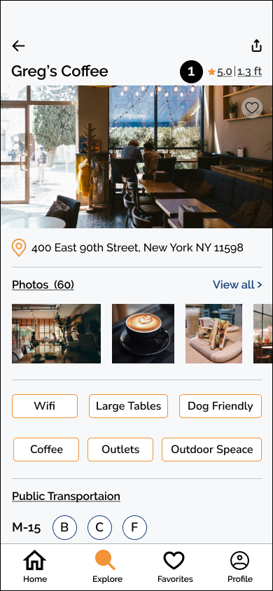

Users were expecting to see reviews on the details page when they scrolled down

Ratings are placed on its own with the addition of the number of people that left reviews
After
Reviews were moved to the details page where users could scroll down and see them
Learnings
Throughout the user interview process, I discovered that for many individuals, stepping out of their comfortable homes to find a workspace poses a significant challenge. While they acknowledge the importance of doing so for their mental well-being, it may not always be sufficient motivation to leave the house.
Given more time, I would explore the possibility of incentivizing users to work outside by implementing a rewards system that offers perks such as free coffee, desserts, and more.
